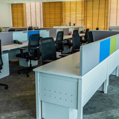

The existing office infrastructure was not suitable for Ayana. It was not exciting. There were too many cabins, and the interiors were too glossy for comfort. As a new generation, new energy company, Ayana wanted its office to firstly be cabin-less and secondly, communicate high ethical standards.
Ayana’s brief to the design team was all about sustainability. Re-use the existing infrastructure wherever possible, maximise natural light, and ensure a classy output within a reasonable budget. In short, the outcome had to honestly convey Ayana’s brand ethos.
The office area was divided into three activity zones and the character for each was defined through smart, simple, and clean lines.
The plan envisaged the floor to designate zones and movement, and in the process tie the space together. The team chose tiles from Shaw Contract’s vertical layers and living systems collections.The tiles’ marked angles and texture conveyed Ayana’s dynamism, environmental consciousness, and international aspirations. Moreover, the Shaw Contract brand matched Ayana’s sustainability and material safety expectations. The wide range enabled the team to narrow down on the exact tiles to align with Ayana’s brand colours.
Awash with natural light, Ayana’s new office is a smart balance of shape and function, light and shade, while ensuring no one element eclipses the other. In short, complete design harmony.
Designer Ankur S Yagnik said, “My first instinct before designing a new space is to ask questions. Many questions - what will space be used for, the personalities of people who inhabit space, their implied and explicit desires, and so on. Only then I get inspired to design.”